Our own lettering, everywhere
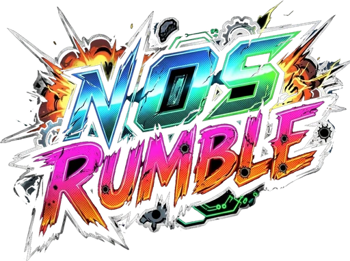
The NOS Rumble lettering from our logo now runs through the menus, this website and the whole game.
The jagged, slanted letters from the NOS Rumble logo are now a proper font, and you'll see them all over: menu titles, buttons, track names and the big Start Race button.
The menus picked up the same inked comic look as the new dashboard, with bold black outlines and hard drop shadows. Longer descriptions keep a clean, easy-to-read font so nothing gets hard to read.
This website got the same lettering on every page, from the home page to every dev blog post, so the game and the site finally speak with one voice.
1font everywhere
0layouts changed
Share this post
Get the next one
New features, dated and short. Sign up on the home page and we will send the highlights.
Get the launch news